Kevin's EDCI 337 Blog

I wonder if I put a few words here?

The Brain (EDCI 337 Group Project)

Overview

As we go about our day, our brains are constantly multi-tasking. It regulates our involuntary bodily functions, like our breathing, blood circulation, body temperature, and digestion, in order to maintain ‘homeostasis’, or the physiological equilibrium needed for us to stay alive. But it also commands our subconscious, filtering out information and making judgements that we ourselves are unaware of.

From the moment we wake up to the moment we go to bed, our brain monitors what we see, how we see it, what we hear, and what we feel. The eleven million bits of information our brain takes in every second is sifted through and refined by various mental filters so that our conscious mind receives only the most important 40 or 50 bits.

The world that we know is pieced together by our brains; those filters control the information that decides how we view ourselves, others, and our environment. In turn, this controls the thoughts we have, the decisions we make, the emotions we feel, and the experiences we remember. To put it differently, they control all of the things that provide colour to the mosaics that are our personalities. And these all-important mental filters are housed within our brain’s cerebral cortex.

Although the processes of the brain are extremely complex and varied, today we will be doing an introduction and overview of the four important parts of our cerebral cortex (the frontal, parietal, occipital, and temporal lobes), how and why they function the way that they do, and the roles that they play in our daily lives.

Cerebral Cortex Overview Video

Lesson Objectives

By the end of this lesson you will be able to:

  • Understand what the cerebral cortex is
  • Identify the 4 parts of the cerebral cortex 
  • Describe their functions 
  • Connect each part of the brain to its function while doing daily activities 
  • Create a model of the brain 

Read/Watch

Crash course video (12:30 min) crash course video to introduce the brain

The Brain (13:55 min) More in depth video focusing on the structure and function of the brain

Cerebral Cortex a 2 minute quick guide to how the cerebral cortex works.

Different lobes of the brain and what each lobe is responsible for

 Cerebral Cortex

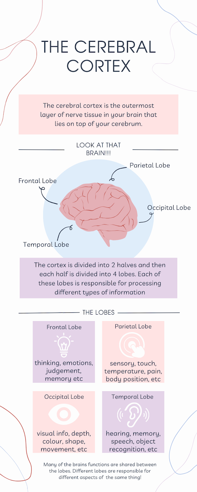
The cerebral cortex is the outermost layer of nerve tissue in your brain. Its numerous folds and grooves give it a wrinkled appearance It has many folds on its surface, giving it a wrinkled appearance. The folds are made up of elevated regions called gyri and deep grooves called sulci. These increase the cerebral cortex’s surface area, which enables more nerve cells to process enormous amounts of information. It is essential for your senses, memory, thinking, learning, reasoning, problem-solving, emotions, and other cognitive and mental processes.

You may be wondering what the differences are between the cerebral cortex and the cerebrum. Your cerebral cortex is the outer layer that lies on top of your cerebrum. Your cerebrum is the largest area of your brain.

The cortex is divided into four lobes: frontal, parietal, temporal, and occipital. Each of these lobes is responsible for processing different types of information. These include and make up the higher-order functions of the brain, such as language, memory, reasoning, thought, learning, decision-making, emotion, intelligence, and personality.

Cerebral Cortex Sketchnote

The outer layer of the cerebrum (the cerebral cortex), composed of folded gray matter and playing an important role in consciousness. 

Cerebral Cortex Ai Generated Audio

Frontal Lobe

Your brain’s frontal lobe is home to areas that manage thinking, emotions, personality, judgement, self-control, music control and movements, memory stages and more. Mankind’s evolution gave us significantly larger frontal lobes comparatively to most other mammals, and is what distinguishes our species. Your frontal lobe contains areas that manage who you are – such as your personality, and how you behave, and is effectively your consciousness. Your ability to think, solve problems and build social relationships, develop a sense of ethics and right vs. wrong. Some things that your frontal lobe is in charge of are listed as the following. Reasoning: simple and complex processing of information. Logic, reasoning, judgement, decision-making and creativity are some of the examples. Social understanding: it controls your understanding of social norms and helps determine what you should do or say. Voluntary muscle movements: these are intentional movements, such as moving your hand to pick something up or moving your legs to stand up or walk around. It also contains the brain area that controls the muscles you use for speaking. Learning and recalling information: it gives you the ability to process and learn new information, in addition to help you retrieve the information later on.

Frontal Lobe Sketchnote

You use your frontal lobe nearly everyday. You use it to make decisions, such as what to eat or drink for breakfast in the morning, as well as for your thinking or studying for a test.

Phineas Gage, a railroad foreman who suffered an injury from an accidental explosion at the railroad construction site, with a iron rod going through Gage’s head, destroying the left side of his frontal lobe. He was a calm, respected leader among his coworkers. Luckily Gage survived but after the accident, his personality changed. He would lose his temper, act disrespectfully and constantly use profanity. Although he mostly recovered from his accident, he died from seizures in 1860.

Frontal Lobe Ai Generated Audio

Parietal Lobe

The parietal lobe is one of the four main lobes of the brain and is located at the top and back of the cerebral hemisphere, behind the frontal lobe and above the temporal lobe.

Parietal Lobe Sketchnote

The parietal lobe is divided into two main regions: the primary somatosensory cortex, which is responsible for processing information related to touch, temperature, pain, and body position, and the posterior parietal cortex, which is involved in higher-level functions such as spatial awareness, perception of time, and the integration of sensory and motor information.

The parietal lobe plays an important role in processing sensory information from various parts of the body and integrating this information with other cognitive functions, such as perception, attention, and spatial awareness.

The parietal lobe does not only do sensory functions,but is also involved in language processing, mathematical reasoning, and problem-solving. Damage to this area of the brain can result in various sensory and cognitive deficits, including difficulties with spatial awareness, language processing, and problem-solving. The parietal lobe is especially used in spatial awareness, in activities such as driving a car, playing sports and basically anything that requires analyzing your surroundings. Damage to the parietal lobe can drastically affect your ability to coordinate your muscles as well as the muscle’s strength.

Parietal Lobe Ai Generated Audio

Occipital Lobe

The lobe located at the back of the brain, just above the cerebellum and behind the parietal and temporal lobes, is the occipital lobe. It’s named after the bone it sits under, the occipital bone in the skull. It is also the smallest lobe. The occipital lobe is mainly responsible for processing the visual information that is taken in by the eyes, such as shape, color, and location of an object. The occipital lobe deals with other aspects of vision, including: distance, depth perception, object recognition, movement, facial recognition, and visual memory information. Humans have binocular perception since both occipital lobes will receive information from both eyes. The brain essentially takes two images and combines them into one image, the process behind this is highly complex and thus studying it is also highly complex and difficult. There are many different things that can happen if the occipital lobe is damaged. Since the occipital lobe primarily deals with vision, one of the possible results of damage is blindness. This blindness can range from complete to partial blindness and that partial blindness can vary. Another, but very rare thing that can happen when the occipital lobe is damaged is Anton syndrome where the individual is blind but is unaware of it and may even actively deny it even if given proof of their vision loss. Another condition is called Riddoch syndrome where the person affected is only able to see moving objects and is even unable to perceive shape or colors. Even some cases of epilepsy are caused by occipital damage. Other examples of dysfunction are: difficulty recognising everyday objects or familiar faces, difficulty understanding basic colors, shapes and sizes, visual hallucinations, etc.

Occipital Lobe Sketchnote
Occipital Lobe Ai Generated Audio

Temporal Lobe

The last lobe resides on both the left and right sides of your brain, just behind your temples – the temporal lobe. It is usually known for its roles in sight and sound, especially since it is so close to the ears, but it also holds many of the most important neural structures that make us humans, human. Various regions in the temporal lobe are responsible for the visual recognition of faces and objects. Additionally, the structures held within this lobe are what allow us to create memories, hold conversations, and feel emotions. There are three major structures that you should take note of: the hippocampus, Wernick’s area, and the amygdala. Your hippocampus is what allows you to create and store memories, it helps with the encoding and recall of memories and the movement of memories from short-term to long-term. The Wernick’s area is the region of the brain that supports speech production and gives us the ability to pair words with meaning. When the Wernick’s area is damaged, it can cause a disorder called Wernick’s aphasia which results in difficulty forming coherent sentences or ‘word salad’. It also works with the Broca’s area, located in the frontal lobe, which controls motor speech. The last important structure, the amygdala, is responsible for the mediation of emotional learning and behaviour, and is most famously known as the ‘fear response center’ as it is what senses danger and triggers our fear responses. Overall, without your temporal lobe, you would be left without the ability to feel, communicate, or remember.

Temporal Lobe Sketchnote
Temporal Lobe Ai Generated Audio

Application

  • Learners will be able to identify how their brains are intaking information in the environment around them. Those going into healthcare may be able to apply the information taught in their work. 
  • Will be able to describe what might happen if a particular part of the brain is injured (i.e. if the temporal lobe was damaged, it might lead to memory loss or changes in fluency and/or language interpretation and expression). Demonstrates learning through the ability to work backwards from a definition with second-order thinking.

Reflection

To Do This Week

  • Read all of this post and the Read/Watch activities 
  • Create a model of the brain using examples of your own for each lobe 
  • Share and discuss your model with your peers 
  • Questions/comments? Come to office hours on Monday/Wednesday at 5pm and we can discuss them together. 

References

Cleveland Clinic. (2022, May 23). Cerebral Cortex. https://my.clevelandclinic.org/health/articles/23073-cerebral-cortex

The Nervous System: Cerebral Cortex. (2016, July 19). ProEdify. [Video]. Youtube. https://www.youtube.com/watch?v=dNngOlsLuGI&ab_channel=ProEdify

  2-Minute Neuroscience: Cerebral Cortex. (2020, October 15). YouTube. Retrieved from youtube.com/watch?v=7TK1LpjV5bI&ab_channel=NeuroscientificallyChallenged

  Lobes of the brain. (2018, July 17). Retrieved from qbi.uq.edu.au/brain/brain-anatomy/lobes-brain

  Meet Your Master – Getting to Know Your Brain: Crash Course Psychology #4. (2014, February 24). YouTube. Retrieved from youtube.com/watch?v=vHrmiy4W9C0&ab_channel=CrashCourse

  The Brain. (2014, March 6). YouTube. Retrieved from youtube.com/watch?v=kMKc8nfPATI&ab_channel=BozemanScienceCleveland Clinic. (2022, December 5). Frontal Lobe. https://my.clevelandclinic.org/health/body/24501-frontal-lobe

Theories and Principles

Our blog post is filled with multiple amazing incorporations of multimedia and one of the many medias’ we’ve used is sketchnoting. As we understand, sketchnoting is a fantastic tool as it is a brain-based learning practice to note-taking that helps with retention. It can be used for vocabulary, comprehension, and note-taking. It also helps with engagement, focus, and memory. Rich visual notes created from a mix of handwriting, drawings, hand-drawn typography, shapes, and visual elements like arrows, boxes and lines elevates your notes further. Summary note-taking, combined with relevant drawings is one of the most effective ways to remember new information and create links to other related concepts and ideas. What’s great about sketchnoting in our blog post is that the topic concerning the cerebral cortex is followed by four lobes, each section designated in a specific part of the brain, working separately yet together. Sketchnoting is very similar in that regard, where the sections of the cerebral cortex are working to create links with one another but also are communicating with one another to complete a person. We find that sketchnoting is an effective way to communicate complex ideas clearly and effectively, it’s a great way to break down a complex idea into smaller components, especially with the additional help of representing the information visually.

In addition to the efficiency of adding sketchnoting in our blog post, it helps to manage the intrinsic load for our viewers. We’ve implemented the idea of segmenting the information about the cerebral cortex into five sections; first an overview of the cerebral cortex, then we separate our information into the other four sections including the frontal, parietal, occipital, and temporal lobes. Instead of throwing a bunch of information into one big paragraph, we’ve broken down each idea into smaller sections to gradually add complexity to each picture, allowing our viewers to control the pace of their personal learning. Furthermore, we would keep overlapping each structure on top of one another, giving our learners the foundation they need to understand the cerebral cortex and its functions. Another important factor we’ve incorporated in our blog post is incorporating the different Mayer’s Principles. We made sure to highlight key information and organize them in a specific way where viewers are able to understand and process the information easily. We made sure that we’re keeping the words and pictures close to each other at the same time as it’s more effective rather than spreading them apart, preventing distraction or losing their train of thought. On top of that, we have kept the labels of what each section of the lobe does next to the diagrams, as well as a fun fact of that section, showing them at the same time, not one after the other to avoid confusion. The key principles we used include the segmenting principle by breaking down our post into sections, the multimedia principle by using many different ways to deliver our content and the personalization/voice principle where we created a personalized video for our overview instead of using the ai voice.

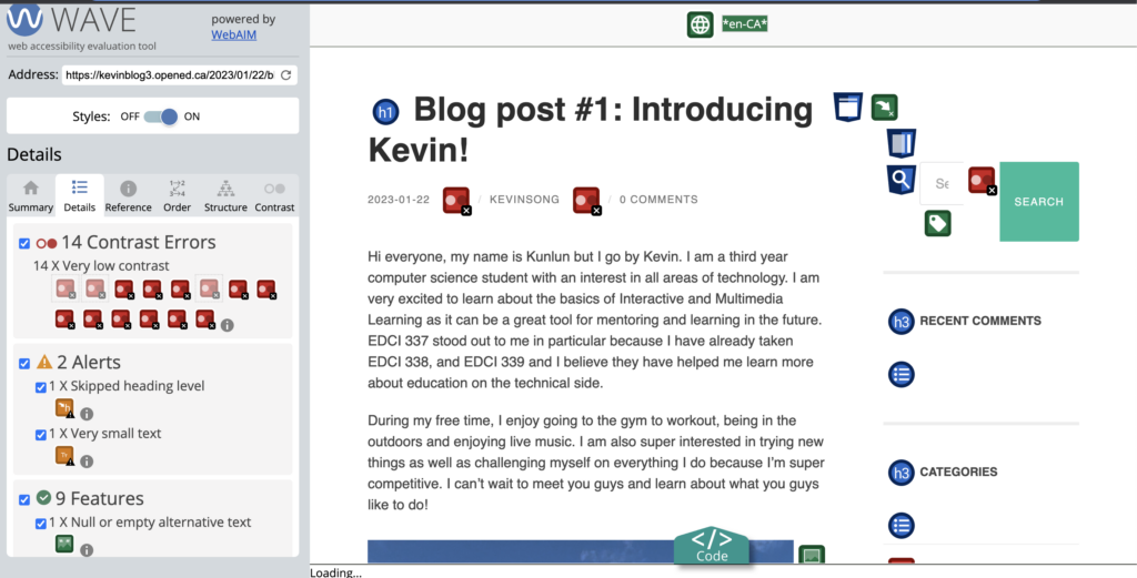
For accessibility our group used multiple methods of learning such as visuals, audio and text. We took extra care making sure that our blog would be accessible for everyone by adding closed captioning to our video, alt text to our images and exploring text to speech for our written portions. We also made sure to follow UDL guidelines by keeping it simple and making sure our sentences were well structured and easy to read. We also ran our blog through the WAVE web accessibility evaluation tool to make changes based on the suggestions that it had for our blog.

WAVE evaluation of our blog

Our group also looked into how we could use AI as a tool for learning in our blog. Our solution to this was to use a text to speech AI generated audio to read our content to our students. Our group thought of using ai generated tools such as ChatGPT to deliver some of our content but we ended up deciding it would be better to come up with it ourselves to avoid ethical concerns.

Too make our blog more engaging we also decided to use both passive and active learning methods. We created a teaching model that would be based off of the Bloom’s Taxonomy where we would hope that our learners would be able to create their own original work after our lesson. We also used scaffolding in the process of delivering our content. This can be seen by breaking the brain into different sections as well as starting with the cerebral cortex to get an overview. After learning all sections of the brain and about the cerebral cortex we would expect our learner to be able to achieve the full understanding about the brain. To test our learners knowledge, we utilized the H5P tool to deliver an engaging quiz for active learning.

When creating our infographic we wanted to make sure that we followed as many of the 8 basic design principles that were taught to us this semester. We ensured that the majority of our text, blocks and images were centered and for the most part very symmetrical, thus following the alignment principle. To show hierarchy we stuck with having some text be all caps and enlarged, though we did not want to change the text too much as that would have been too many different fonts and that generally goes against best practice and can start to look overwhelming. We used color specifically so that it would compliment the main graphic used which was the brain. We also made sure that the text had high contrast always to make reading legible and the infographic was even put through a color blindness filter to make sure that it would still be legible and pleasing to the eye for those with color blindness. This also ensured we had enough contrast between different color elements. While the symmetry throughout the infographic provides balance we also had the text surrounding the brain unsymmetrical, but still having balance between the left and right sides as well as above and below the graphic. Too much symmetry can look boring, so we wanted to avoid that here.

We also wanted to make sure that we followed other best practices in infographic design such as limited color palette, simple imagery, consistent style, keeping white space, limited fonts, and sizing. A lot of these were followed as we can see. Our color palette is limited to 3 main colors other than black and white with some small elements deviating for about a total of just about 6 total different colors. Imagery was kept very simple and consistent style wise, with plenty of white space throughout to ensure there was not too much overloading of elements.

We wanted to make certain that we didn’t just have good multimedia learning design elements but also good instructional design. We wanted to follow Merrill’s Principles of Instruction as it has been applied to us this semester. We have provided a few videos on our subject that showcase things like animations to demonstrate the learning material. We have also created our own learning material such as the infographic and sketchnotes to help facilitate learning and to break down the larger bits of information and text into smaller bite sized pieces. They also help in reminding learners key information and bigger ideas, which activates past knowledge in their minds. We also have the quiz to have students apply their new knowledge and to give them feedback on what they do and don’t know. We also have in our lesson plan to have students create models of the brain on their own and to relate real world scenarios to each section of the brain that they have learned about and then to discuss with other students, this being another form of interactive activity to apply their learning and to gain feedback from others.

With regard to storytelling, the ability to contextualize information is critical to the learning process, especially biology. We wanted to make sure that the information would stick in the students’ minds, and to do that, the best way is to create some sort of story. Including small details that are more akin to ‘fun-facts’ in the otherwise information-heavy descriptions, it allows the mind an opportunity to create links and strengthen the learning. As well, creating a video gives a more humanistic quality to the blog post, creating personal connection rather than just reading text off the screen.

Keeping in mind Bates’ SECTIONS model, we aimed to create a lesson that caters to students new to this topic, refrains from using complex interfaces in favour of more straight-forward iterations, avoids any cost barriers (such as paid subscriptions for quizzes or expensive reading materials), uses media (i.e. video and interactive quizzes) to facilitate effective teaching, creates interactions between the teacher and the student using video, quizzes, and the offer of office hours, encourages networking and peership between students, and protects the privacy of all involved parties.

Assignment 4 Tables

https://docs.google.com/document/d/1JbfzQBUXnUWxq6Zr7SacUAp4hCn1ERXNZxLICEUdYK8/edit

Assignment 3

According to the definition of multimedia, it is referring to more than one medium of expression or communication by combining text, graphics, audio, and video with links and tools that let the user navigate, interact, create, and communicate to the material. In this case, I created a video of a previous presentation I did. The presentation was presented in person hence there was no actual recording but I decided to improve the slides following the different multimedia skills we learned in class. To start, I used QuickTime Player to record what the slides looked like before the I made any changes.

After looking after the original slides it quickly came to my attention that I was not doing a good job with many of the Mayer’s principles. I think I did a good job in choosing different images for media but the problem was that I really needed to follow the Redundancy Principle which suggests that humans learn best with narration and graphics, as opposed to narration, graphics, and text. Many of the slides were completely flooded with text which could instead just be simplified and delivered without having any text at all and just a picture with audio in the background. Another one of the principles that stood out to me was the Spatial Contiguity Principle which could also be applied to the slides as I would be getting rid of some text and would really have to focus on how the slides looked and if they would be enjoyable for the listener. Lastly by having a recording and not just the slides I would be able to improve and use the Modality, Temporal Contiguity, and Segmenting principles. To summarize, these three principles state that humans learn best when using audio compared to text and when the information is given to them by more than one source in a digestible section. I think the slides already segmented each part very well but they could still be cleaned up a little bit. To make it super accessible to everyone I decided to make the slides quite simple and mainly visual as my audio recording will make up for the lack of text. Too much text or complex imagery can be distracting according to the modality principle.

While recording the video I tried my best to follow the Voice and Personalization Principle’s by presenting in a more informal, conversational voice than an overly formal voice. Basically I was trying my best to sound like a human and not a robot. However I found this quite tough as I have anxiety when presenting and it was hard to be super fluent while being under pressure. I also decided not to have a picture of myself in my presentation as the image principle states, people do not necessarily learn better when the speaker’s image is added to the screen. Thus I thought my voice and the slides was perfect.

Aside from the Mayer’s 12 Principles of Multimedia, I tried to use the Universal Design for Learning (UDL) guidelines to make my video as accessible as possible. This is seen by having audio, imagery, and closed capturing. By using these methods I believe I improved the overall accessibility and was able to make the material more accessible, enjoyable and effective for all types of learners.

The whole goal for this assignment was to deliver the information about ancient chinese painting in a more accessible form and although my approach was quite simple I believe that a huge part of accessibility and effective teaching is to keep it simple.

References:

Mayer, R., & Fiorella, L. (2014). Principles for Reducing Extraneous Processing in Multimedia Learning: Coherence, Signaling, Redundancy, Spatial Contiguity, and Temporal Contiguity Principles. In R. Mayer (Ed.), The Cambridge Handbook of Multimedia Learning (Cambridge Handbooks in Psychology, pp. 279-315). Cambridge: Cambridge University Press. doi:10.1017/CBO9781139547369.015

Principles of Multimedia Learning – Center for Teaching and Learning | Wiley Education Services. (2016, July 19). Center for Teaching and Learning | Wiley Education Services. https://ctl.wiley.com/principles-of-multimedia-learning/

Blog #5

In week 11 we dived into really learning and understanding what is active and passive learning. First, we looked at how gamification could be used as a method of teaching to really engage the audience with the material provided. After watching the video on Historia, it showed how that you could experience learning History by going back in time and living in the world where the history is supposed to be learned in the form of a game. This elevated version of gamification made it so the students would talk about the game and actively talk to each other about the history. The competition aspect makes the students want to succeed in the game and to be successful the students would have to learn the history so that they would have an advantage compared to their peers. The only thing that I think could have been improved is that I see gamification not being accessible for everyone and games are really hard to create so that they fit UDL Guidelines so that everyone can have the same positive experience in the game. To support this method of learning I think it would be greatly beneficial to incorporate other multimedia tools such as sketch notes or infographics so that there is more of a path to learning other than for the students to basically just figure everything out in the game.

In this course, I have found that there is a good balance of both active and passive learning. Having the material delivered to us in many forms such as videos, articles as well as having us discuss in our groups, I found that the use of both active and passive learning was very present. I loved the aspect of being able to share our ideas we learned during the week in a blog post as well as meeting with our groups to discuss the content. Also if we would ever need extra help we could go to office hours or ask questions via email or Mattermost. My other classes are quite lacking in terms of ways of learning as they would mostly be lecture based and test based while having a teams or slack channel to ask questions. I also found that the response time in other classes can be quite slow so it was quite easy to be behind and not have the support to bring yourself back up to speed. The different methods of teaching really helps engage us as a learner and I think that is the main thing other classes lack.

When trying out H5P, I thought that it was definitely a very useful resource that can help you easily incorporate different methods of teaching so that your content can be more engaging. The one thing I would suggest when using H5P is to be careful to not overwhelm the learner because SECTIONS and TPACK says that sometimes keeping it simple is better than overloading the learner. To incorporate this in this week’s blog I decided to throw in some questions about computer networking that can be used to help engage the learner in a method other than just reading. I think that H5P has a lot of potential and I am honestly surprised that I don’t see it being used more often.

Additionally, this week we also learned about the term scaffolding which is used by teachers to help students when they learn something new or want to improve at a skill they already know how to do. Scaffolding is defined as the process through which a teacher adds supports for students in order to enhance learning and aid in the mastery of tasks. My personal experience with scaffolding comes from being a swim instructor and teaching swim lessons. This is seen when teaching swimming skills in progressions like when wanting to teach someone how to do freestyle we first break down the skill into smaller manageable parts. This is done by first doing body position (practicing gliding as well as floating) then by adding our kicks, and finally also adding our arms. By teaching them separately we can work on them independently before merging them to complete a skill. Another time we use scaffolding is when providing feedback to the swimmers we not only give verbal feedback but we also do many different forms of feedback such as physical manipulation and visual demonstrating the skill.

References:

Mathers, B. (2017). Wikipedia – Active vs Passive learning. https://bryanmmathers.com/wikipedia-active-vs-passive-learning/ CC-BY-ND (images for Active/Passive Learning interactivity)

2-interactive videos. Video-Editing. (n.d.). Retrieved March 26, 2023, from https://uviclibraries.github.io/video-editing/h5p.html

YouTube. (2014, February 11). Game-based learning brings the history of civilization to life. YouTube. Retrieved March 26, 2023, from https://www.youtube.com/watch?v=n2EV8nLeBK4

Blog #4

3 Important Ways Artificial Intelligence Will Transform Your Business And  Turbocharge Success

In week 8 we looked into learning the usability of artificial intelligence and how they can be useful to us as tools. This topic in particular interests me due to my background in computer science and interest in machine learning as well as artificial intelligence in general. It was great looking into the different uses and types of artificial intelligence because it allowed me to explore areas that I haven’t used before. My personal experience with artificial intelligence is developing as I really wanted to take the class CSC 421 (Introduction to Artificial Intelligence) but it wasn’t offered this semester. I have had time to explore using artificial intelligence myself with using apps such as Quillbot and ChatGPT to help create and respond to emails. I also tried using stable diffusion to generate images for me but I found that it was quite similar to a google search so I didn’t find it as useful as something like ChatGPT. ChatGPT is superior because it is basically like a better google search but sometimes has incorrect answers due to the internet having wrong answers or biased answers in general. This topic was especially nice to me because I am planning to participate in UVIC AI Club’s BattleSnake Competition on Saturday March 11 and have already started making my Battle Snake with python AI libraries such as pytorch.

I think that artificial intelligence is a very dangerous tool when it comes to educational institutions because educational institutions want you to write your own work and not have an artificial intelligence tool do the work for you. This is especially problematic in research because ChatGPT has the power to generate whole papers. Also artificial intelligence uses web scraping which is basically like getting information on the web from like any source and thus it isn’t correctly cited. That aside, these tools can still be very useful and should still be used as a effective learning tool. I often use ChatGPT to answer questions I have to help me study for upcoming midterms and questions that aren’t easily as answered. Even while doing this, it is still important to do your own fact checking because ChatGPT can also be incorrect.

In the future, I believe that I will continue to use AI tools such as ChatGPT but now there are a lot of competitors in the field and OpenAi (Owners of ChatGPT) are planning to make ChatGPT a subscription so there might be better free alternatives. I will continue to use AI tools to help me answer questions as if I was making a google search but won’t use them to directly answer questions that have to be done by myself because as easy as it is to generate the artificial text, the same engine can detect if text is likely to be also made by an artificial source. I think the tools in 2-3 years will continue to evolve very fast as machine learning and artificial intelligence has proven to be extremely useful and there is a lot of competition to be the go to search engine. This is seen with Microsoft and Bing working to improve on their own search engine.

In week 9 we moved on from artificial intelligence and focused on storytelling with videos. First we looked at Rich McCue’s example of storytelling about backing up your laptop. He did a really good job with interacting with the viewer and using audio as well as visuals to captivate the viewers senses. He did a good job with using visuals, having himself in the videos to add the teaching presence, keeping the videos short and concise to retain information and allowing people to rewatch the videos to give us the flexible access. He is an expert himself but I think he could have also got a secondary source to make him more credible and tell more of a story even though his topic was definitely hard for storytelling.

When it comes to meaningful learning experiences that started with a story the one that comes in mind the most in Pinocchio where it effectively made the story interesting as well as teaching a very impactful skill about the consequences of lying. I recognized a lot of the principles but the ones that weren’t used as much was allowing the learning to be active why learning as well as keeping it short because to sell the story it is pretty long and you have to follow a huge journey so it can be a two ended sword but in this case it worked well.

The story board that I decided to create for a short video story with a learning purpose is my trip to Strathcona’s King’s Peak and what to do when your car breaks down. Here is a part of my storyboard that I made for when I make a video about the trip and what we learned from our experience.

In the 7 storytelling techniques used by the most inspiring ted presenters I found all the presenters had their strengths and weaknesses but overall their presentations were amazing. The ones that stood out to me the most was Richard Turere as his story was so passionate and it is unbelievable that a 12-year-old boy could tell his story so well. It was very captivating and interesting learning as Richard was able to clearly show the problems he faced and how he took on these challenges by creating a system of lights to protect his family’s livestock from lion attacks. It shows that under pressure he was able to think outside the box and come up with a brilliant solution which is super inspirational. Richard used the techniques immerse your audience in a story, tell a personal story, create suspense, bring characters to life and ending with a positive takeaway especially well.

When I personally present I try to use as many techniques as I can but I think my strongest techniques are telling a personal story as I know the details super well as well as immersing the audience because it is crucial to keep everyone interested when presenting before anything else. I really want to focus on working on the showing and not telling as that is an extremely hard skill I have been working on for a while. I have had practice giving presentations and overcoming my social anxiety in the past by attending Toast Masters International where I have previously already looked at these skills. The other skill I really want to improve on is building up to the S.T.A.R moment. I think it is crucial to have an effective climax in your story to really deliver the punch of having a good story.

References:

Wu, G. (2022, December 22). 5 Big Problems With OpenAI’s ChatGPT. MakeUseOf.

O’Brien, M. (2023, February 1). Google has the next move as Microsoft embraces OpenAI buzz. Britannica.

Marr, B. (2020, August 3). 3 important ways Artificial Intelligence Will Transform Your Business and turbocharge success. Forbes. Retrieved March 12, 2023, from https://www.forbes.com/sites/bernardmarr/2020/08/03/3-important-ways-artificial-intelligence-will-transform-your-business-and-turbocharge-success/?sh=73fee247620f

McCue, Rich, 3-2-1 Backup Rule, University of Victoria Library, Digital Scholarship Commons, from EDCI 337

7 storytelling techniques used by the most inspiring TED presenters. (2022, September 27). Visme Blog. https://visme.co/blog/7-storytelling-techniques-used-by-the-most-inspiring-ted-presenters/

Blog #3

In week 5 we had a look at exploring design principles for multimedia presentations. To do this I started a Canva account to find a template that was well suited for presenting my topic. The topic I chose was a how to guide on traveling that helps someone plan out a potential travel trip. After setting up the template, I followed both Mayer’s Inclusive Design principles and Universal Design for Learning principles to make my infographic as effective as possible. Some key points I followed was to have just 6 objects per slide to follow the Cognitive load theory as well as using good illustrative images that are relevant to each subject with the text so that it could give a visual narration of what is happening. For example the car picture for transport uses multimedia and modality principles as well as the signalling principle to signal that there is an important point here. Another thing to note is that I also took advantage of having a good amount of white space to improve the readability of the content and to ensure that the reader won’t feel overwhelmed by the information. When comparing my infographic to the six promising practices for infographic design, I believe that I followed just about all of them pretty well. I limited my colour palette by having the background being beige and for the main coloured sources being the images which were very simple. I made sure the sizing was good and that I didn’t have an excessive amount of different fonts.

When considering those that have visual impairments on my infographic, I believe I had a good share of different presentation methods with both the images as well as the text to explain the images. I think that the colour contrast on the other hand could be improved however there was a limited selection of each object that I wanted to describe. I also could’ve made the text a little larger and if I tried really hard maybe implement tactile graphics or audio descriptions although I don’t know if these are very easy using Canva. The overall accessibility is still pretty good in my opinion.

Instructional Design Principles for Remote Teaching and Learning – Friday  Institute for Educational Innovation

In week 6 we looked into instructional design and lesson planning. To practice lesson planning, I used the template given to us and created a lesson plan on teaching front crawl to my swim lesson. This lesson plan was a solid however I think that for evidence of learning I would like to add that they would be able to recognize that they are doing something wrong such as kicking with bent knees.

My experience with video learning game learning supports is quite good. I believe that video game developers carefully use Universal Design, Merril’s First and Mayer’s inclusive design principles when creating learning supports such as quests or basic instructions to guide you through the game. A game that I played recently called Valorant also has a very effective learning support built in where there is instructions for each ability or agent and also a tutorial and training mode where you can practice different guns and abilities in a training area before you go to actual battle. I believe that Merril’s first principles that are focused on problem solving is done really well in Valorant as they let you try everything in basically a real virtual instance in the training ground as well as letting you learn progressively in a tutorial setting. All the new knowledge is demonstrated, applied and then integrated into the players world which is amazing. However when games don’t do this effectively, this is devastating because players will lose interest without even knowing how to play the game correctly.

One case where you would design a lesson using Merrill’s principles is anything where there is a task that involves problem solving. This could be as simple as baking a cake as you would need to create media such as a post or piece of paper with steps on what to do.

I see constructive alignment and backward design used in courses all the time. For example in my CSC 361 Computer Networkings class, the professor always starts by identifying the desired learning outcomes and then works backwards to design assignments and his lectures to support these learning outcomes. This way as a student I am able to know what I need to know without having to memorize a lot of extra fun facts that are just bonus to be successful in the class. This is especially seen when by my professor when he designed large programming assignments on learning different network protocols such as TCP, UDP, RDP connections by first acknowledging that this is one of the learning outcomes of the class and then testing our ability to implement each different protocol in an assignment. Another class I have taken in the past called software development methodologies didn’t follow constructive alignment and backward design. It was a challenging course not because the course material itself was hard but because he wouldn’t tell us what the topics were going to be tested and often included very small points in his lecture that seemed to have no significance in the time when hearing it. If he had let us know that this is something important to know, everyone would have been much more successful in achieving the learning outcomes of the class.

References:

McCue, R. (2021, February 20). Introduction to Infographics with Canva & Related Multimedia Learning Principles [MP4]. https://www.youtube.com/watch?v=K1k3deWbw2c

Johnson, D. (2021, February 19). Design and Layout with Canva [Mp4]. https://www.youtube.com/watch?v=g3pdyid7BjU

Biggs, John, Constructive Alignment in University Teaching, HERDSA Review of Higher Education Vol. 1, www.herdsa.org.au

Merrill, M. D. (2002). First Principles of Instruction. ETR&D, 50, 3. pp. 43-59.

Wiggins, G. and McTighe, J. Understanding by Design. 2nd ed. 2005. Web.

Blog #2 Week 3 and Week 4 Reflections

In week 3 we looked at the Mayer’s 12 Principles of Multimedia. When looking at these principles I realized that I previously intuitively followed the signalling principle where I would look at the bold text at in a textbook to understand the key terms as well as when taking notes I would highlight the important points so that when I skim through my notes later on, I know what is important to look at. One principle that I didn’t follow before was the redundancy principle. The redundancy principle shows that when using audio to not include graphics on the screen. Previously when doing presentations, I would have the text on the slide as well as verbally say the same points. Knowing that this can be overwhelming to the learner, I will avoid having so much text on my slides in the future.

I used sketch noting to during my CSC 361 class which was computer networks. My sketch note helped me visualize the information so that when the topic comes up again, I could easily put a picture in mind for what it is. My drawing skills were quite bad as I am not much of an artist and didn’t have any colours available. I believe that many of the Mayer’s theory principles were at work here mainly the principle of segmenting and breaking down the information as well as modality because typical notes have way too much text. Sketch noting is very useful for any learning activity that requires a lot of memorization.

In week 4 I used the WAVE report to see how the accessibility is on my blog 1 introduction post. I expected there to be a few problems with the page but overall it was not too bad. It was surprising that a lot of the issues were contrast errors but when looking at how to fix it, a lot of them were in locations that were not easy to change other than by editing the WordPress page. However there were also some feedback that could be changed such as small text or not having a heading for clarity. These changes can be implemented in the future.

A huge part of effective learning is to also utilize audio not just text and visual features. To do this, we can use text to speech tools to give us the audio we need to elevate our learning process. When using the text to speech tool to read my blog, it helped me realize grammar mistakes as well as sentences that didn’t flow well. These couldn’t have been easily identified by just reading the text. I think the voice of the audio is also super relevant because if the voice is monotone it is easy to zone out and lose focus.

When using media and multimedia, we can achieve the goals of UDL by providing multiple ways to access and engage with information and experiences. For example, multimedia can be used to provide images, videos and audio representations of information, that can accommodate different learning styles and strengths.

Accessibility is part of an Inclusive design methodology

When designing certain things we need to consider how we can make something accessible to everyone. Inclusive design for me means being able to provide the best user experience for as many people as possible. This means that we are making pages more dynamic and going away from the classic one design for everyone mentality. By following the UDL guidelines, it can also help ensure that we deploying inclusive design.

References:

DeBell, A. (2022, December 14). How to use Mayer’s 12 principles of multimedia learning [examples included]. Water Bear Learning. Retrieved February 8, 2023, from https://waterbearlearning.com/mayers-principles-multimedia-learning/

Wave report. WAVE Web Accessibility Evaluation Tool. (n.d.). Retrieved February 8, 2023, from https://wave.webaim.org/report#/https://kevinblog3.opened.ca/2023/01/22/blog-post-1-introducing-kevin/

Sehl, K. (2023, January 5). Inclusive Design for social media: Tips for creating accessible channels. Social Media Marketing & Management Dashboard. Retrieved February 5, 2023, from https://blog.hootsuite.com/inclusive-design-social-media/

Miller, J. (2018, October 18). Inclusive design and accessibility. Medium. Retrieved February 5, 2023 from https://blog.prototypr.io/inclusive-design-and-accessibility-50718a3ac768

Accessibility and Equity Blog Post #2

The difference between Equality and Equity

Equality and equity are very similar yet have their own distinct concepts. Equality refers to treating everyone the same without considering an individuals differences or specific needs. Equity, on the other hand, refers to treating everyone fairly in a different way by making sure that everyone has the resources available for them to be successful. Equity recognizes that individuals may have different needs and that treating everyone the same will not result in equal results or opportunities. However Equity is a very controversial topic as people can take advantage of the situation to give themselves an upper-hand. This is commonly seen when applying for jobs or schools and there are things such as affirmative action where someone may have an advantage given their background. Though Equity is very important as some people just need the extra support to reach the same level of success as everyone else.

Inclusive Design

When designing certain things we need to consider how we can make something accessible to everyone. Inclusive design aims to provide the best user experience for as many people as possible. This means that we are making pages more dynamic and going away from the classic one design for everyone mentality. I believe this is super relevant to my work because as a mobile software developer I often have to fulfil requests from clients wanting certain buttons changed or other UI changes for specific people. This can either be changing pictures for a more inclusive feeling, making buttons or icons larger or simply adding further instructions. Through my time programming I have found older adults often struggle with technology due to these non inclusive designed apps and widgets. Some things to look out for when making a design is to make sure that the design has text that is accessible to everyone, provide sufficient description, add video captions and try to avoid controversial or sensitive topics.

Accessibility is part of an Inclusive design methodology

References:

Sehl, K. (2023, January 5). Inclusive Design for social media: Tips for creating accessible channels. Social Media Marketing & Management Dashboard. Retrieved February 5, 2023, from https://blog.hootsuite.com/inclusive-design-social-media/

Miller, J. (2018, October 18). Inclusive design and accessibility. Medium. Retrieved February 5, 2023 from https://blog.prototypr.io/inclusive-design-and-accessibility-50718a3ac768